Modular Interfaces for Photomaton and Speedlab
01.Brief
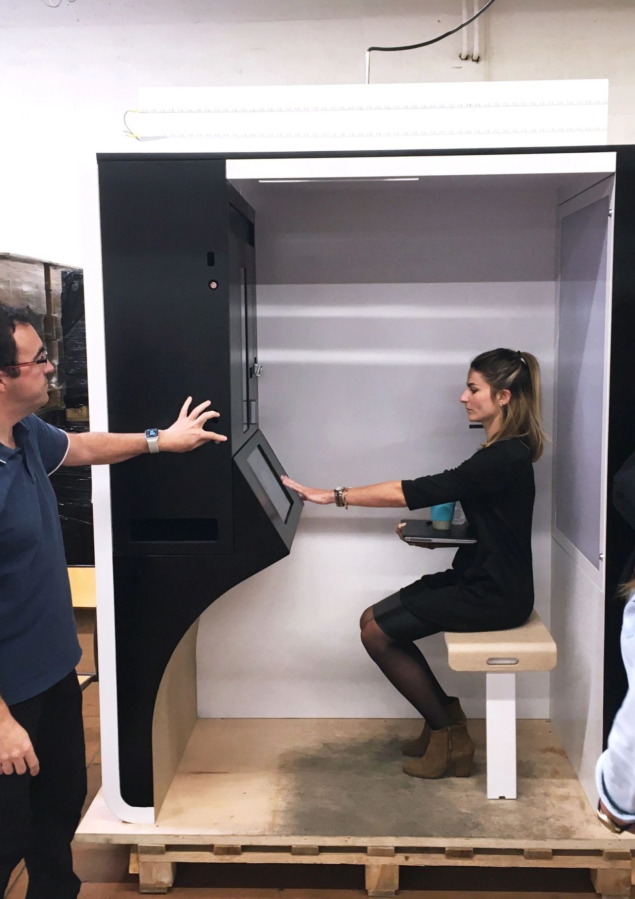
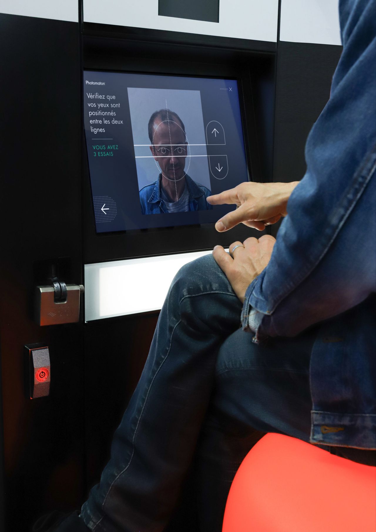
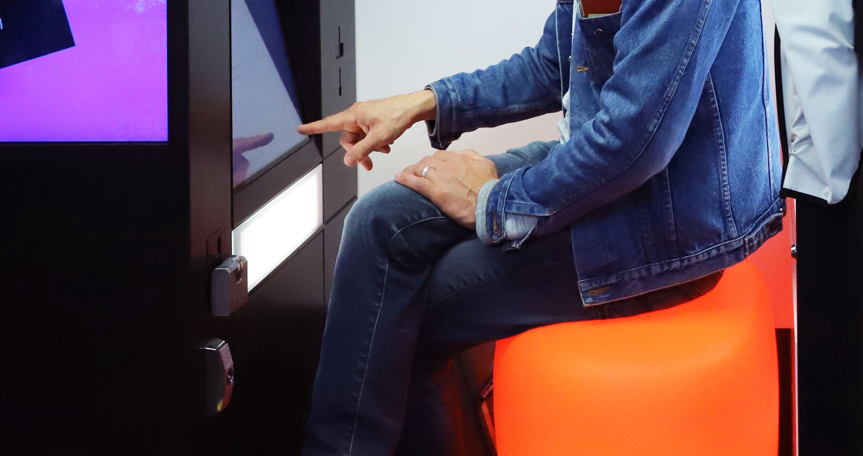
In 2019, the KIS Group, a major player in vending and photo kiosk services (Photomaton, Speedlab, Photo-Me, Prontophot, Fotofix, etc.), assigned us with designing a new touchscreen interface for the iconic Photomaton booth. Simultaneously, we began working on a new version of the Speedlab photo printing kiosks. A long-term collaboration was established with the group’s marketing, engineering, and development teams. By 2024, the interfaces were deployed and contributed to a revitalization of the group’s physical booths, maintaining their appeal in a sector transformed by digital usage.
02. .Interfaces designed for all audiences, in all countries
The pursuit of simplicity guides our UX design work. To address the following issues simultaneously, the same interface must:
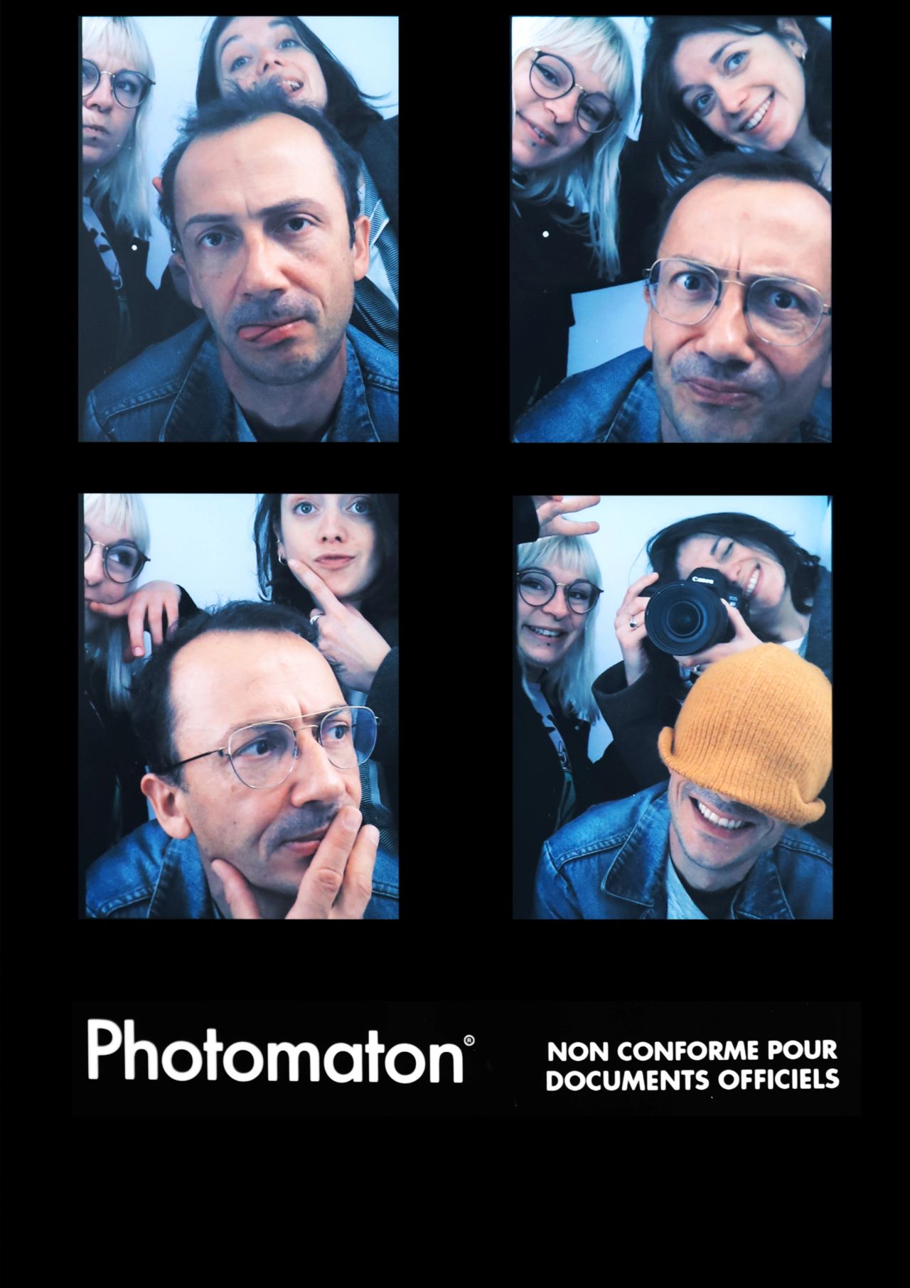
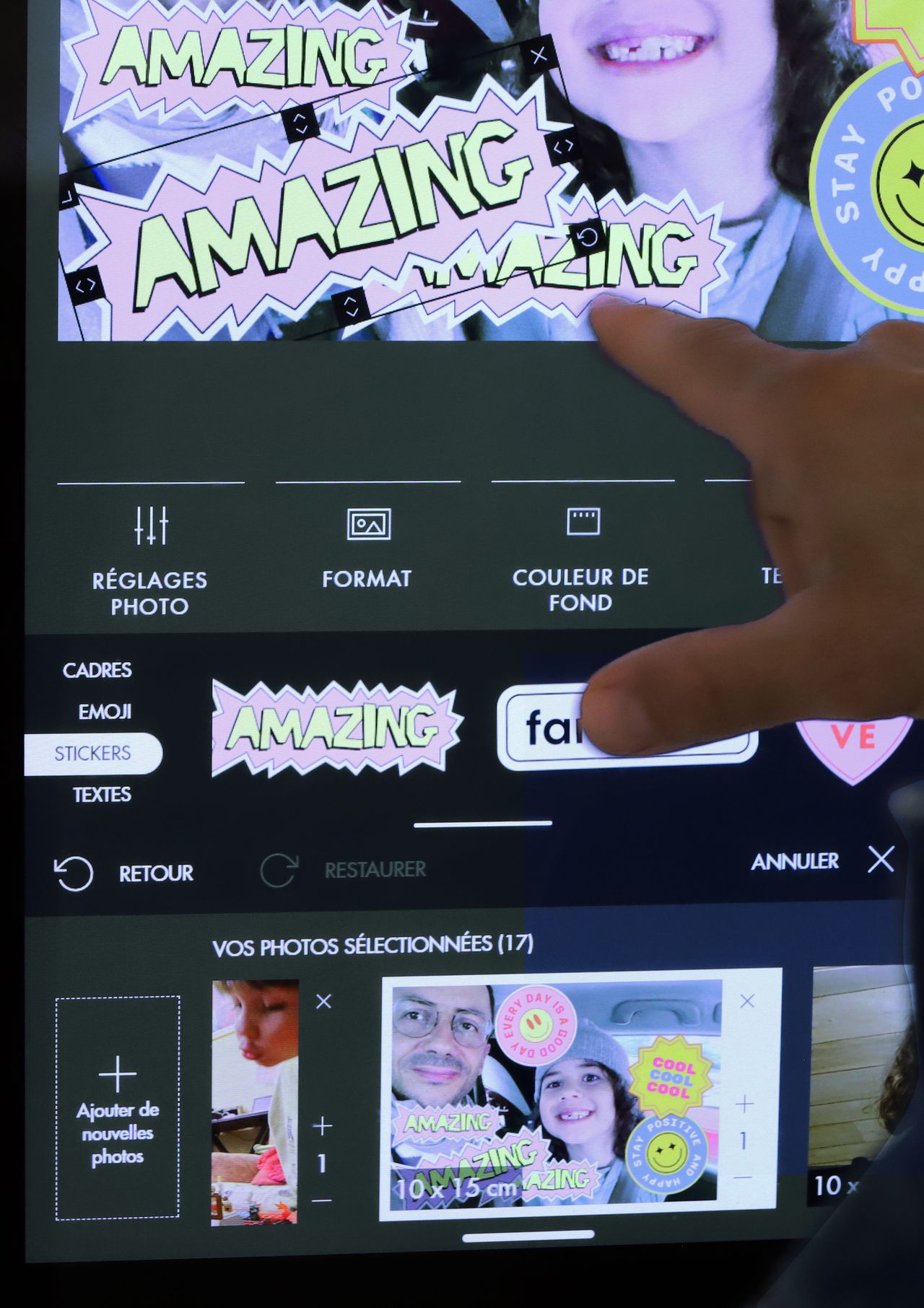
- Accommodate nearly opposite uses: highly utilitarian for identity photos, or seemingly unrestricted for fun prints.
- Be deployed in dozens of countries: its content must be adaptable without altering the design of the interface.
- Be usable by all audiences, whether they are familiar with digital technology or not.
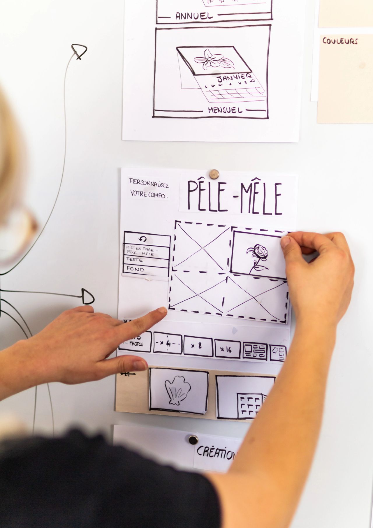
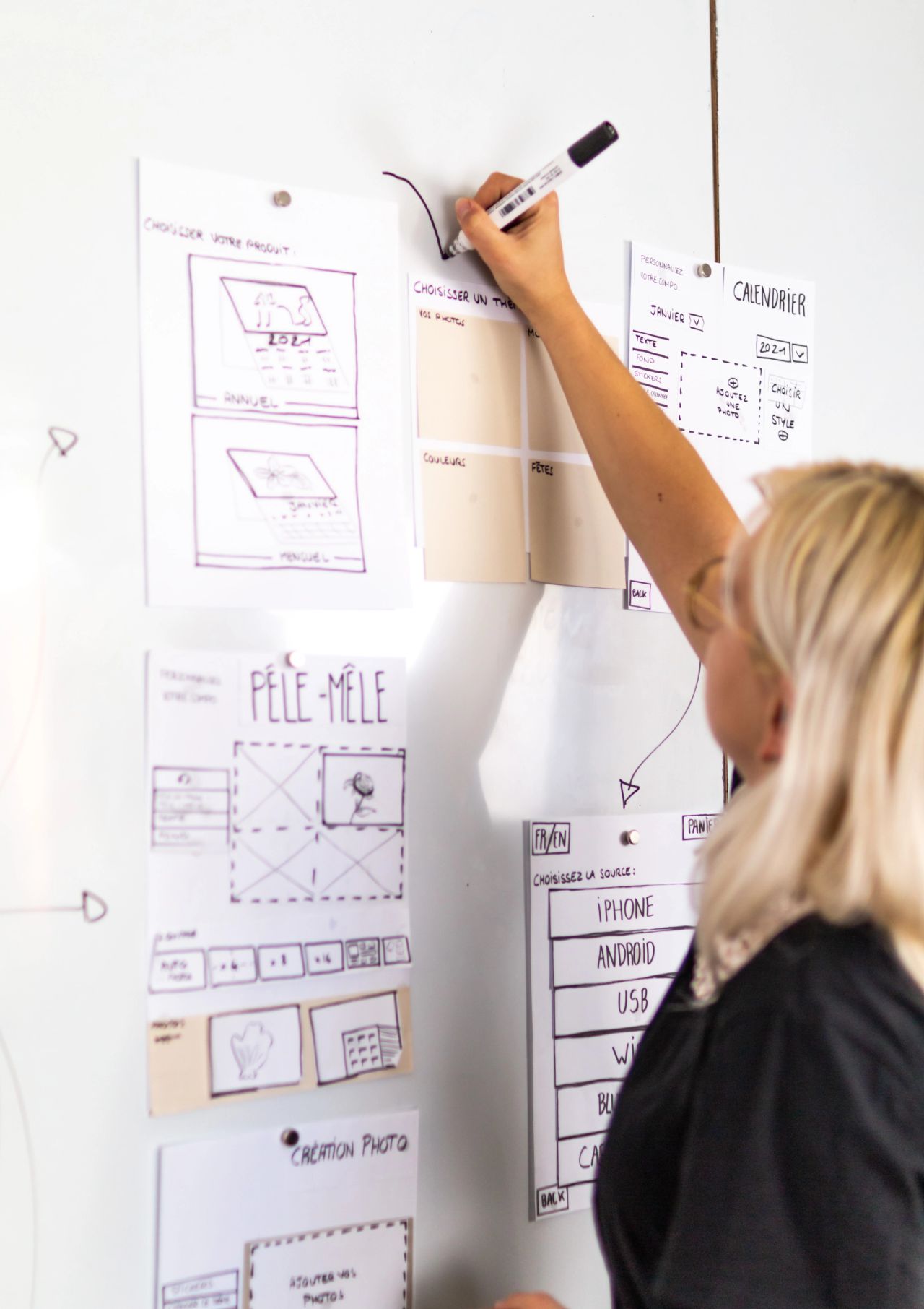
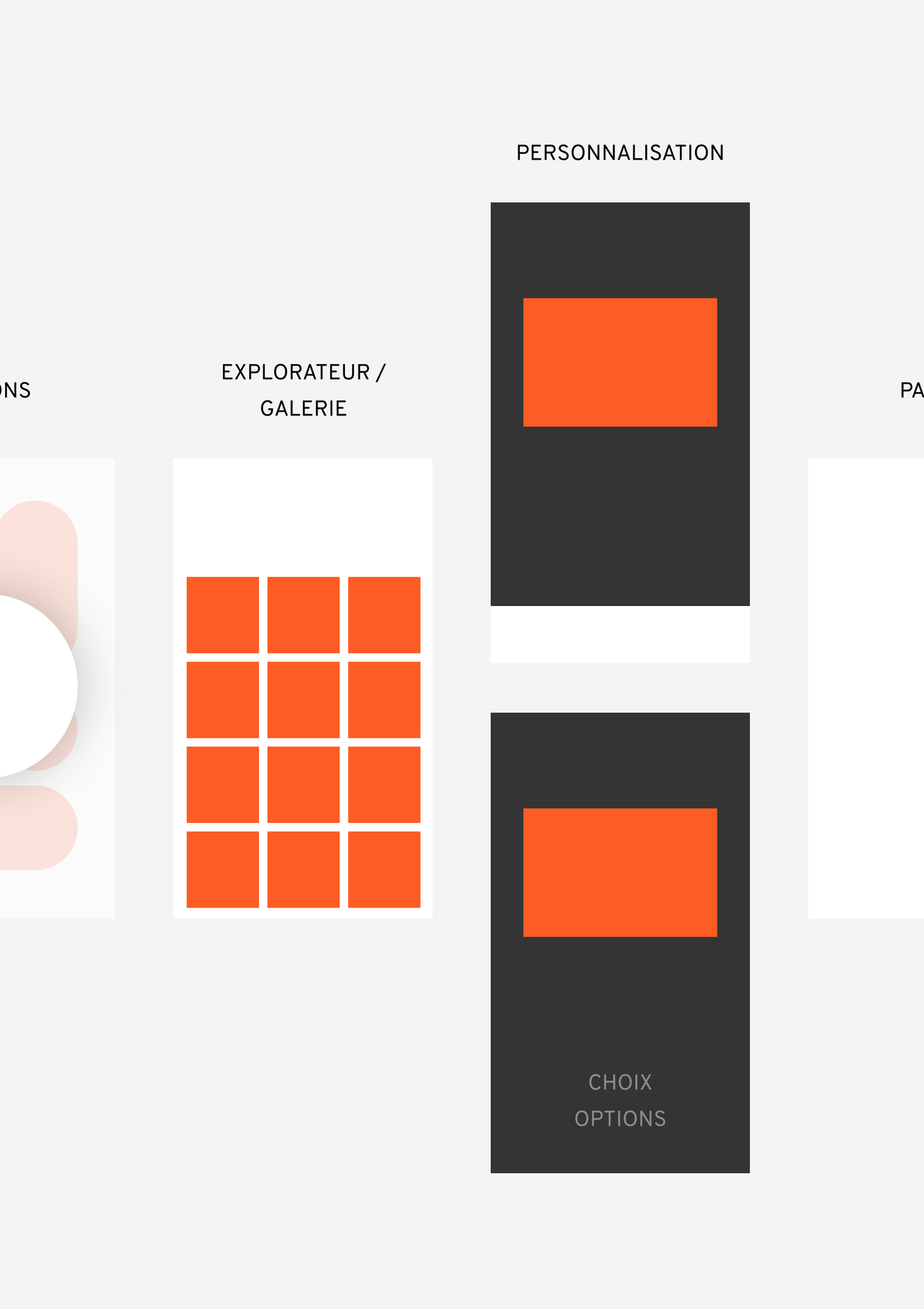
The result: a navigation system that relies on a versatile graphical composition framework, capable of accommodating different products based on photocabin configurations.
Adapt
Retrofit the old booths with the new design
For Photomaton, the goal is to deploy the new interface across a fleet of several thousand booths, including configurations dating back to the 2000s. We take this constraint into account and design an interface with modern aesthetics that can function on sometimes outdated operating systems with limited touch performance. The graphical choices of the interface thus help extend the lifespan of the machines.
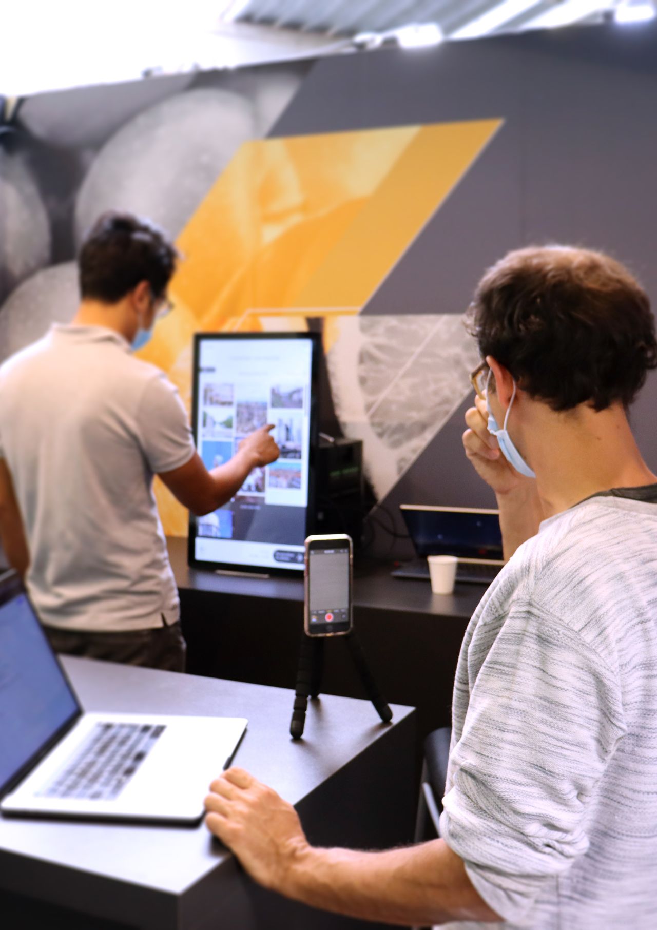
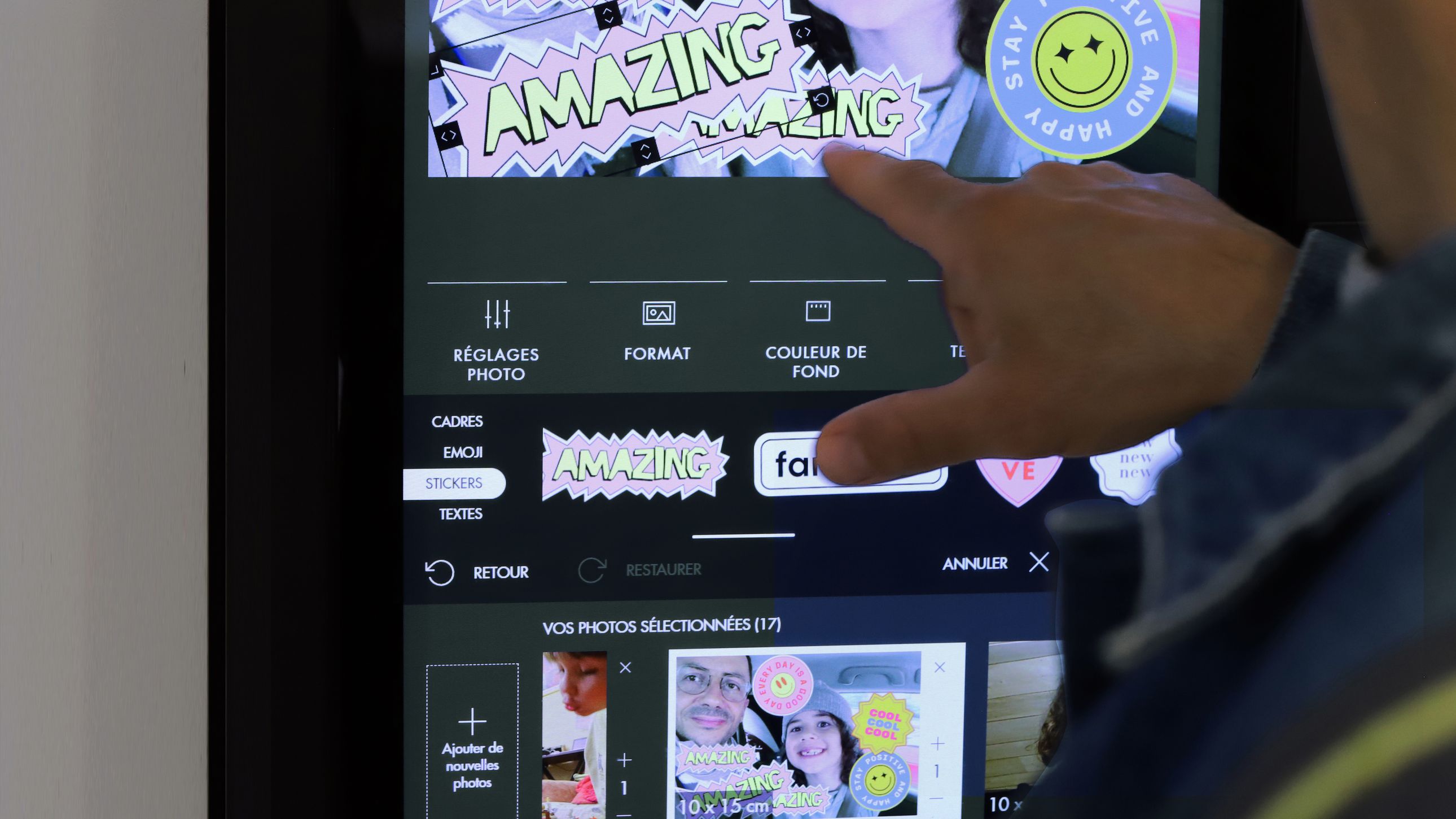
For Speedlab, the aim is to encourage users to spend time working on their images and to give them a glimpse of the customization possibilities.
To address these two challenges, we collaborated with the Manic Motion studio to create optimized animations for tiles and icons.
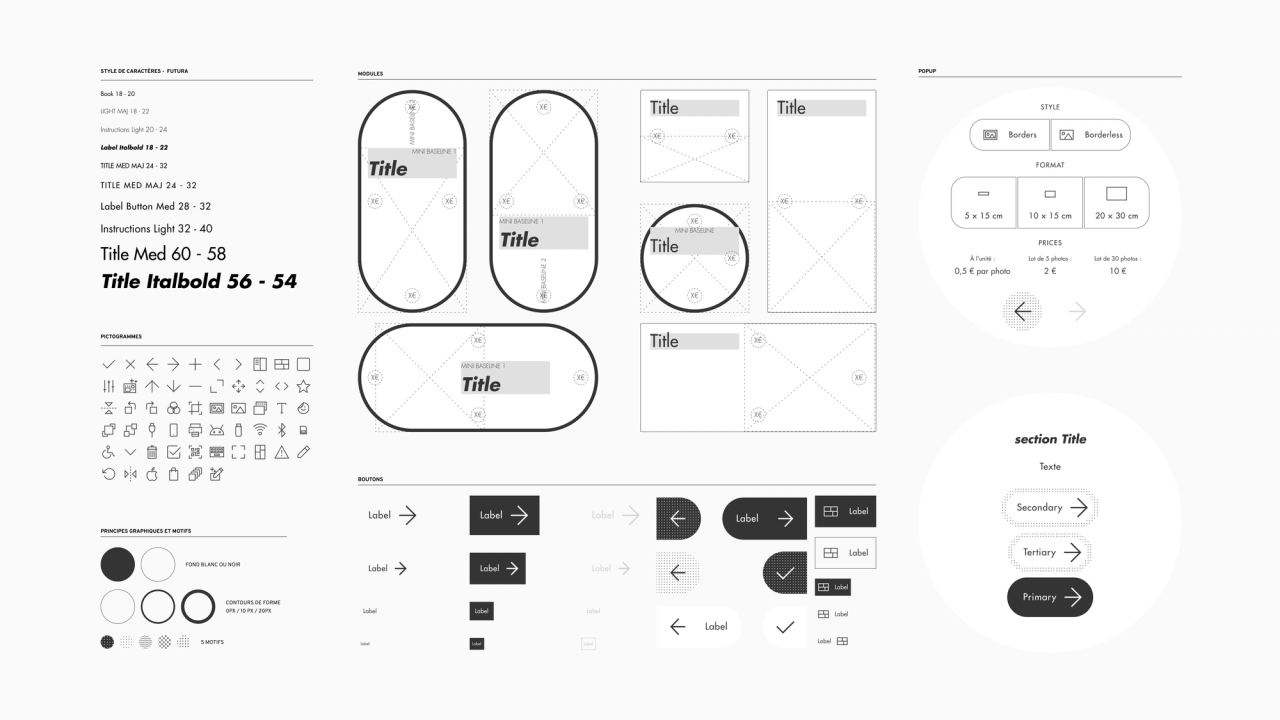
The choices for graphic design are guided by two priorities:
- Rely on the logo's identity (Futura + black + white, no gray, no shadows) to create an interface that enhances the Photomaton brand image, rooted in the world of photography and fashion. The use of black and white ensures excellent accessibility and creates a seamless range between Photomaton and Speedlab booths.
- Avoid using the booths orange signature designed by P. Starck to easily adapt the interfaces for white-label applications — as done with the Speedlab interfaces for Fnac Photo.

Results
Positive impact
Machines can be retrofitted rather than replaced.
Simplicity
The experience becomes more coherent, and the offer can evolve without affecting clarity.
Satisfaction
A high quality of experience which corresponds to the requirements displayed by the KIS Group.
